

Asciify
ASCII art for Resolume
What it does
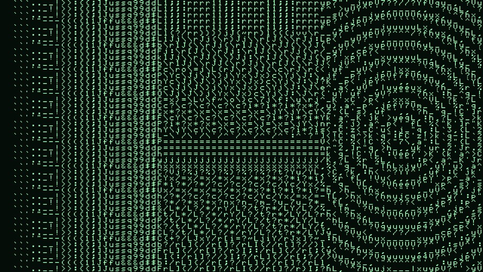
A character renderer for Resolume Arena and Avenue. The frame is divided into character cells and each cell is replaced by the one character that stands in for it best — and the interesting half of that is what "best" means.
Most ASCII art is a brightness ramp: measure a cell, look the value up in a hand-written string like " .:-=+*#%@", print that character. It works, and it throws away every edge in the picture. Asciify treats a cell as a small picture instead, and picks the character whose ink is distributed most like it. Two things are measured, on the same 8×8 grid, for the cell and for every glyph: how much ink there is, and where it sits. The second half is enough to tell | from -, / from \, and . from ' — so edges start choosing characters that lean the right way.
Nothing detects an edge. There is no edge detector and no threshold anywhere in it: a cell containing a diagonal simply has a shape vector pointing the same direction a slash does. Two behaviours fall out of that rather than being features anyone added. Structure at zero is exactly the classic ramp, with no separate code path, because weighting the shape term to nothing leaves a nearest-neighbour lookup by weight. And flat cells ignore the control entirely, because a cell with no direction has nothing to be wrong about.
Nor does anything in it carry a dark-to-light ordering. The font is drawn in the source, every glyph's ink is measured off its bitmap, and the ramp is a consequence — so a custom alphabet works whatever order you type it in. On this font the measured order of the traditional ramp turns out to be ".-:+=*%#@", which is not the string everybody copies: the hyphen outweighs the colon, and the percent sign is lighter than the hash.
Also available as an OpenFX plugin for DaVinci Resolve, Vegas Pro, Nuke and Natron — the same font, the same measured ramp and the same moment matching, rendered on the CPU.
- Structure — how far the match may stray from the correct weight to get the shape right; at zero it is the classic tone ramp
- Columns from 8 to 320, with rows following the output aspect so cells stay square and characters are never stretched
- Nine alphabets — ASCII, letters, digits, symbols, the classic ramp, binary, block elements, box drawing, and a custom set you type yourself in UTF-8
- Block elements are the only characters that reach solid black and white, so that set is the one that can be photographic; box drawing has almost no tonal range and is chosen essentially on structure alone
- Tone and contrast with the neutral setting in the centre of the slider, and an ordered dither of exactly one quantisation step for short alphabets
- Ink and paper colours, a Tint control that hands the ink over to the clip's own colour, and a paper opacity that leaves the background transparent so only the characters composite
- Universal macOS bundle, a Windows DLL, and an OpenFX bundle for macOS, Windows and Linux
Where it stands
Built, measured and released, and now on the 1.0 line at v1.0.5. The OpenFX build for Resolve, Vegas, Nuke and Natron arrived in v0.2.0; everything since has been dependency and CI maintenance, plus v1.0.4's Windows installer, which no longer touches the system PATH — the earlier one could overwrite it — and v1.0.5's real description in the field Resolume shows for an effect. Which character a cell chose is a fact rather than a matter of taste, so it is checked as one: the plugin is rendered at exactly one output pixel per glyph pixel, which makes every cell of the frame an 8×8 glyph bitmap that can be read back and named, and those are compared against an independent C++ implementation of the same matching — 43 runs of 960 cells across every character set, with zero disagreements. That path covers the mip chain, the tone curve, the dither, the moment measurement, the search and the atlas addressing at once. All eighteen controls are swept and shown to affect the output, including the text field. The macOS universal bundle, the Windows DLL and the Linux OpenFX bundle all build in CI, and the Linux one is loaded in a Rocky 8 container and asked for the entry points a host calls first. FFGL stays macOS and Windows, because Resolume has no Linux build. Still open against all of that: it has never been loaded into Resolume, so how the controls present in the host is untested — in particular whether the custom-alphabet text field appears at all — and performance has never been measured.
Watch it running
Nothing loads from YouTube until you press play.Watch it there instead